I actually DID go to school and study typography but that still doesn't change the fact that when I see fonts I still categorize them in my special families and categories... like "fun and whimsical" or "old west" or "futuristic space". My naming conventions aren't very original but it gets the job done.
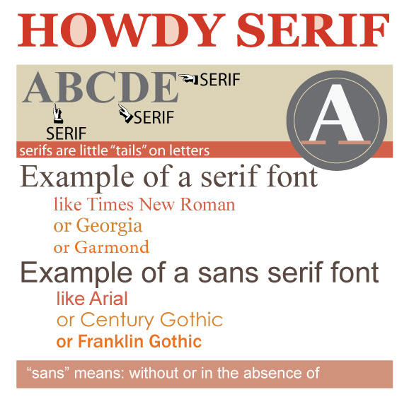
One thing I did learn in school was the difference between two very important font categories and that stays with me today. Those categories are serif and sans serif.
A serif font is font who's letters have little tails on them. A typeface with serifs are called serif fonts. One without the little tails is called a sans-serif font from the French word "sans", meaning "without".
Studies show that serif typefaces are easier on the eyes for reading in print, especially when used on cheaper papers like newsprint. However the low screen resolutions on computers make a sans-serif typeface easier to read on monitors.